

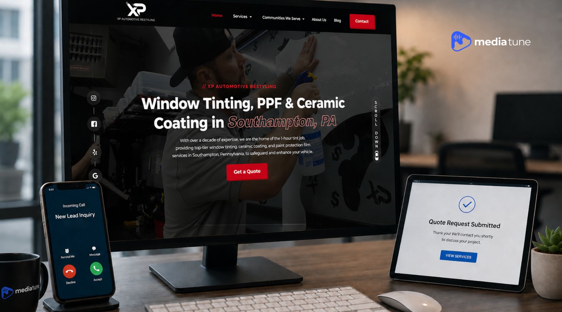
Those three things are understanding the offer, trusting the business, and taking the next step.
That sounds simple. But many websites make at least one of those steps harder than it needs to be. The design may look polished while the service is unclear. The homepage may attract attention but give visitors no useful path forward. The contact form may ask for too much information, or the call button may be difficult to find on a phone.
Good website development for lead generation connects the full experience. The message, service pages, navigation, proof, mobile performance, calls to action, forms, and tracking should all support the same business goal.
A website cannot guarantee that every visitor will become a customer. Traffic quality, pricing, the offer, the market, and follow-up all matter. But the website should not create unnecessary reasons for a qualified prospect to leave.
Don’t want to read the full blog? Watch this quick video overview of how website development can support lead generation.
Traffic only helps when the site gives the right visitor a clear path to act. If people are reaching your pages but serious inquiries are still weak, the message, service structure, mobile experience, forms, and tracking may need to be reviewed together.

A Converting Website Is Built Around a Customer Decision
Most business owners begin a website project by thinking about appearance. They choose colors, photos, fonts, animations, and page layouts. Those choices matter because the site should represent the company well. But appearance is not the first conversion question.
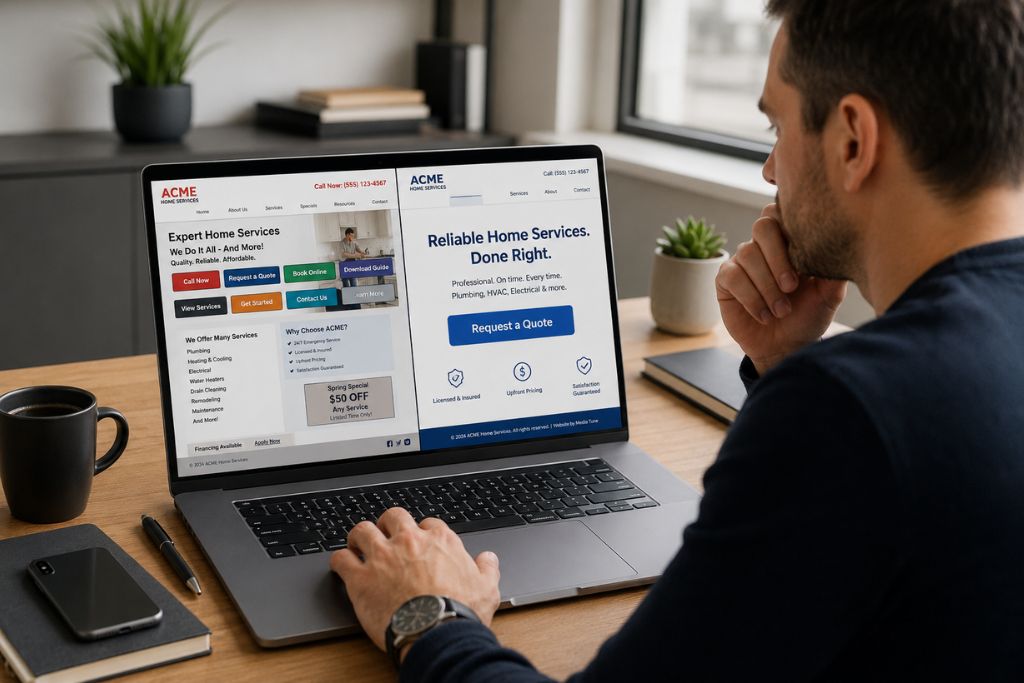
The first question is: what decision should this visitor be able to make on this page?
A person looking for window tint may want to know which film fits their driving needs and how to request a quote. A vehicle owner researching paint protection film may need to understand coverage options before contacting a shop. Someone looking for marine protection may be comparing services, timing, and maintenance expectations.
Those visitors do not all need the same information. They do need a clear path.
For each important page, the business should define one primary action. That may be calling, requesting a quote, booking a consultation, scheduling service, or viewing a more specific service page. The page should then be built around helping the visitor feel ready to take that action.
Use the understand, trust, act test
A practical way to review any business website is to ask three questions:
- Understand: Can the visitor quickly tell what the business offers and whether it fits their need?
- Trust: Does the page give the visitor enough real information and proof to feel comfortable contacting the business?
- Act: Is the next step clear, easy to find, and easy to complete on the device they are using?
When one part is missing, the lead path weakens. A clear offer without proof can feel risky. Strong proof without a visible next step can leave the visitor stuck. A large quote button cannot fix a page that never explains the service.
Clear Messaging Helps Visitors Know They Are in the Right Place
A visitor should not have to study the homepage to understand the business.
The opening section should explain what the company does, who it helps, and what the visitor can do next. For a local service company, it may also need to make the service area clear. For a specialized shop, the wording should reflect the actual services customers search for.
A broad statement such as “Premium solutions for your lifestyle” may sound professional, but it does not help a customer decide whether the company installs window film, protects boats, upgrades car audio, or provides another service.
Clear messaging is usually more useful than clever messaging.
A stronger opening may identify the main service category, the customer type, the market, and the outcome. It should then offer one obvious next step. The visitor can keep reading for detail, but the basic fit should be clear early.
The message should match how the visitor arrived
Someone who lands from a Google search, an ad, a Google Business Profile, or a social post may arrive with a different level of knowledge. The page should match the promise that brought them there.
For example, an ad for commercial window film should not send visitors to a homepage where residential tint, automotive services, and unrelated offers compete for attention. The page should continue the same conversation the ad started.
That message match reduces confusion. It also makes it easier to measure whether the page is doing the job it was built to do.
Strong Service Pages Turn Interest Into a Real Decision
The homepage introduces the business. Service pages help customers decide.
A shop that offers several services should not expect one general page to answer every buyer question. Window tint, PPF, ceramic coating, detailing, vehicle electronics, architectural film, and marine protection each involve different needs, objections, processes, and calls to action.
A useful service page should explain:
- What the service is and which problem it addresses
- Who the service is a good fit for
- What options or decision factors the customer should understand
- What the process generally involves
- What proof or company information supports trust
- What the visitor should do next
The page does not need to answer every possible question. It does need to answer enough of the important ones that a qualified customer can move forward without guessing.
This is where a website built to turn qualified traffic into leads differs from a basic online brochure. The page is not only describing the company. It is helping a real person evaluate fit.
Media Tune’s Website Design & Development service focuses on responsive structure, intuitive navigation, service-focused content, performance, and conversion actions that support that decision path.
Trust Signals Reduce the Risk of Contacting the Business
Contacting a service business carries some uncertainty.
The customer may be wondering whether the company has handled similar work, whether the service will meet expectations, whether the business is established, and what will happen after the form is submitted.
The website should reduce that uncertainty with real information.
Useful trust signals can include project photos, service-specific examples, approved reviews, an About page, clear contact information, process details, team information, and accurate explanations of what the service can and cannot do.
Proof should be specific enough to mean something. A row of generic badges or stock photos may fill space, but it does not necessarily answer the customer’s concern.
The same rule applies to claims. Certifications, warranties, years in business, client results, and performance numbers should only appear when they are verified. A smaller truthful claim builds more trust than a larger claim the business cannot support.
Navigation and Page Structure Should Keep the Next Step Obvious
Good navigation is quiet. The visitor notices it when it fails.
A service-business website usually needs a simple route to the homepage, core services, work or proof, company information, and contact options. Service pages should link to related questions and the next logical action without sending the reader in circles.
The page layout matters too. Headings should help visitors scan. Important details should appear before long background information. Calls to action should show up at natural decision points rather than only in the footer.
Repeating a primary action can be useful on a longer page. Competing actions are the problem.
A page that asks the visitor to call, request a quote, download a guide, join a newsletter, follow four social channels, and browse unrelated services at the same time can weaken the main decision. The website should make priorities clear.
Mobile Performance and Page Speed Protect the Lead Path
Many service customers will first see the website on a phone.
They may be standing beside a vehicle, comparing providers during a break, or trying to call quickly after finding the business in search. A desktop layout that simply shrinks onto a smaller screen is not enough.
Mobile pages should use readable text, stable layouts, clear tap targets, compressed media, forms that fit the screen, and contact buttons that work without zooming or searching.
Performance matters because every delay adds friction before the visitor has received value. Google’s current good-experience targets for Core Web Vitals are an LCP within 2.5 seconds, an INP under 200 milliseconds, and a CLS at or below 0.1. These measure loading, responsiveness, and visual stability.
Those numbers are useful technical targets, not a promise that a page will convert. A fast page with a vague offer can still fail. A strong offer on a slow, unstable page can still lose people before they understand it.
A complete page-experience review should also consider mobile display, HTTPS, intrusive popups, and whether the main content is easy to distinguish. The goal is not a perfect score for a report. The goal is a website customers can use without avoidable interruption.
Traffic only helps when the site gives the right visitor a clear path to act. If people are reaching your pages but serious inquiries are still weak, the message, service structure, mobile experience, forms, and tracking may need to be reviewed together.
Calls to Action and Forms Should Remove Friction
A call to action should tell the visitor what happens next. Buttons such as “Request a Quote,” “Book a Consultation,” or “Call the Shop” are clearer than “Submit” or “Learn More” when the desired action is specific.
The wording should match the page and the visitor’s stage. Forms need the same clarity.
A business may want every detail before following up, but the visitor may not be ready to complete a long application. Ask for the information needed to handle the next step, then collect more detail during the conversation when appropriate.
A lead form should use clear labels, useful instructions, understandable error messages, and a confirmation that explains what happens after submission. On mobile, fields and buttons should be easy to tap.
Phone-driven businesses should also make click-to-call actions easy to find. Some customers would rather explain the project than type it into a form.
More fields do not always mean better leads
A longer form can filter inquiries, but it can also stop qualified prospects who are short on time or do not yet know every answer. The right form length depends on the service, sales process, lead volume, and information the team truly needs.
That is why form performance should be measured instead of decided by preference alone.
Landing Pages and Website Pages Do Different Jobs
A service page and a campaign landing page may discuss the same service, but they often have different jobs.
A service page supports broader research. It may explain options, answer questions, link to related content, and help organic visitors compare the business. A landing page for a paid campaign is usually more focused. It should match the ad, the audience, the offer, and one primary action.
Sending every campaign to the homepage can create a gap between the customer’s search and the page they receive. The visitor clicked for a specific reason. The landing page should respect that intent.
That does not mean every landing page must be short. The right length depends on how much information the customer needs before acting. A higher-consideration service may need more proof and explanation than a simple appointment request. Media Tune’s paid advertising approach connects targeting, message, landing-page experience, and conversion tracking so the campaign is not judged by clicks alone.
Conversion Tracking Shows Where the Website Is Breaking Down
Without tracking, a website problem can look like a traffic problem.
A business may know how many people visited, but not which page produced a call, where users abandoned a form, or which marketing source brought the strongest inquiries.
Useful website conversion tracking can include:
- Phone-call clicks and tracked calls
- Contact-form starts and submissions
- Quote requests
- Booking or consultation actions
- Clicks to important third-party scheduling tools
- Lead source and landing page
- Qualified, unqualified, and closed-lead outcomes when the systems support them
Google Analytics can record events such as form_start, form_submit, and generate_lead when they are implemented correctly. Those events help answer different questions. A form start with no submission may show friction. A completed form shows an action, but the business still needs lead-quality information to know whether the inquiry was valuable.
The point is not to collect data for its own sake.
The point is to find where qualified visitors stop moving. That may lead to a shorter form, clearer copy, a stronger service explanation, a different CTA position, or a dedicated landing page.
SEO and Website Development Should Support the Same Lead Goal
SEO can help a business appear when customers search. The website has to handle what happens next. Search-friendly service pages, clear site structure, internal links, mobile usability, and performance help search engines understand the site and help visitors use it.
The two goals often support each other. But traffic and conversion should still be reviewed separately.
A page can rank and attract the wrong audience. Another page may receive fewer visits but produce better inquiries. The business needs both search visibility and a website experience that helps the right customer act.
Media Tune’s SEO services focus on local and competitive search visibility while connecting content and website improvements to qualified traffic.
That is why website development for lead generation should not be treated as a design project isolated from SEO, paid ads, content, and reporting. The website is the point where those channels meet the customer.
Why Good-Looking Business Websites Still Fail to Convert
A polished website can still be a weak sales tool.
Common reasons include:
- The opening message does not explain the service or customer fit
- The homepage tries to serve every audience at once
- Important services do not have focused pages
- Trust relies on vague claims instead of real proof
- Navigation creates dead ends or hides contact options
- Mobile pages load slowly or are difficult to use
- Forms are too long, broken, or unclear
- Calls to action compete with one another
- Traffic is sent to a page that does not match the search or ad
- The business does not track meaningful actions or lead quality
A visual redesign may fix some of these issues. It will not fix all of them unless the project also addresses content, page hierarchy, forms, tracking, and the customer journey.
That is the difference between making a site look newer and making the site work harder for the business.
A Practical Website Conversion Checklist
Before deciding that the business needs more traffic, review the website itself.
Can visitors understand the offer?
- The main service and customer fit are clear early
- Each priority service has a useful page
- The page matches the search, ad, or link that brought the visitor
- The next step is easy to identify
Can visitors trust the business?
- Project examples, reviews, and company information are real and current
- Service claims are specific and supported
- The process and expectations are explained
- Contact information is easy to verify
Can visitors act without friction?
- Calls to action use clear language
- Forms ask for necessary information and work on mobile
- Click-to-call buttons function correctly
- The confirmation tells the visitor what happens next
Can the business measure and improve the path?
- Calls, forms, bookings, and quote requests are tracked
- The landing page and traffic source are recorded
- Lead quality can be reviewed beyond raw submission counts
- The website can support testing and future service growth
If several answers are no, adding more traffic may only send more people into the same weak path.
How Media Tune Approaches Website Development for Lead Generation
At Media Tune, we look at the website as part of the full lead-generation system.
The site needs to represent the brand, but it also needs to support how the business sells its services. For automotive, window film, vehicle electronics, architectural film, and marine protection companies, that means building around real customer questions and clear service paths.
Those pieces should work together.
Media Tune’s verified website-development services include responsive architecture, intuitive navigation, custom UI and UX development, performance-focused builds, SEO-friendly structure, landing-page optimization, form integration, conversion tracking, A/B-testing readiness, security, and ongoing support.
A fast page helps the visitor reach the message. The message helps them understand the service. Proof helps them trust the business. The CTA and form make contact easier. Tracking shows what needs to improve next.
That is what turns a website from a digital brochure into a useful business asset.
FAQs About Business Website Conversion
A website converts when it helps the right visitor understand the offer, trust the business, and complete a clear next action. Messaging, service pages, proof, mobile performance, navigation, forms, calls to action, and tracking all contribute to that path.
The most important foundation is alignment between the visitor’s need, the page message, and the next action. No single button, form, or design feature can replace that alignment.
Each page should usually have one primary action, repeated at useful decision points. A secondary option such as calling can also help, but it should not compete with several unrelated actions.
Service-specific paid campaigns usually benefit from a focused landing page that matches the ad and gives the visitor one clear path. A homepage may make more sense for broad brand searches or visitors who need to explore the company first.
Track meaningful actions such as phone calls, form starts and submissions, quote requests, consultation bookings, and scheduling clicks. Review the landing page, traffic source, and lead quality so the business knows which activity creates real opportunities.
A redesign may be justified when the site no longer reflects current services, performs poorly on mobile, loads slowly, hides important information, creates contact friction, cannot support tracking, or no longer fits the business’s growth plan. The project should fix the underlying conversion path, not only update the appearance.